Aldrin Varghese — UX Designer, enterprise AI
av

I design enterprise AI people can audit, then I ship it.

Three years as the sole UI/UX designer across ten-plus enterprise AI platforms — cost estimation, supplier governance, procurement intelligence — from research and lo-fi structure through a unified design system to production Angular.

Aldrin Varghese
0+
years, enterprise AI
0+
platforms, sole designer
0
design system, unified
0
company awards
Estimation AI·Supplier onboarding & KYS·Technical evaluation agent·Procurement dashboard & benchmark·EasyBuy AI·Enterprise AI chat· Estimation AI·Supplier onboarding & KYS·Technical evaluation agent·Procurement dashboard & benchmark·EasyBuy AI·Enterprise AI chat·
01 — sixty seconds

If you read one screen of this portfolio, read this one.

person_edit

What I do

Sole designer on a suite of AI platforms for a UAE real-estate developer. Domain research, lo-fi structure, hi-fi Figma on a shared component library, then the production Angular front-end.

insights

What I'm good at

Making machine output legible: evidence beside every score, a delta beside every change, provenance one tap from every number. Dense data screens that stay calm at a thousand line items.

workspace_premium

What it earned

The GEM Award (2026) from the VP of AI Engineering — the citation noted clients asked for these designs to be replicated across their other initiatives. Earlier, the ACE Award (2024).

alt_route

Below: one project taken end to end — the navigation flow first, then every screen in it, annotated with what I contributed and why each decision was made. Client names are withheld and nothing confidential is shown.

Start with the flowarrow_downward
02 — case study

Estimation AI

Construction cost estimation, from a sentence typed into a chat box to a published, auditable estimate.

Client
A UAE real-estate developer
My role
Sole designer, end to end
Team
PM, frontend, backend, AI/ML
Users
Estimators, cost managers, project leads
The problem

A preliminary estimate meant assembling comparable past projects by hand, reconciling spreadsheets, and re-running everything each time an assumption moved. It was work measured in weeks.

The design bet

Let the model do the assembly, but never let it hide its reasoning. Every AI-produced number carries its evidence: match scores, source projects, unit rates, and a visible delta whenever anything changes.

The outcome

The client's teams took to it quickly and described the platform as genuinely useful for work that used to take weeks. The design language was then requested for replication across their other initiatives.

What was mine

I designed the complete application end to end — information architecture, conversational flow, the estimate table, versioning and publishing — through repeated review rounds with stakeholders, the development team and managers. The estimating logic and matching model were the AI/ML team's; making their output readable, checkable and safe to act on was mine.

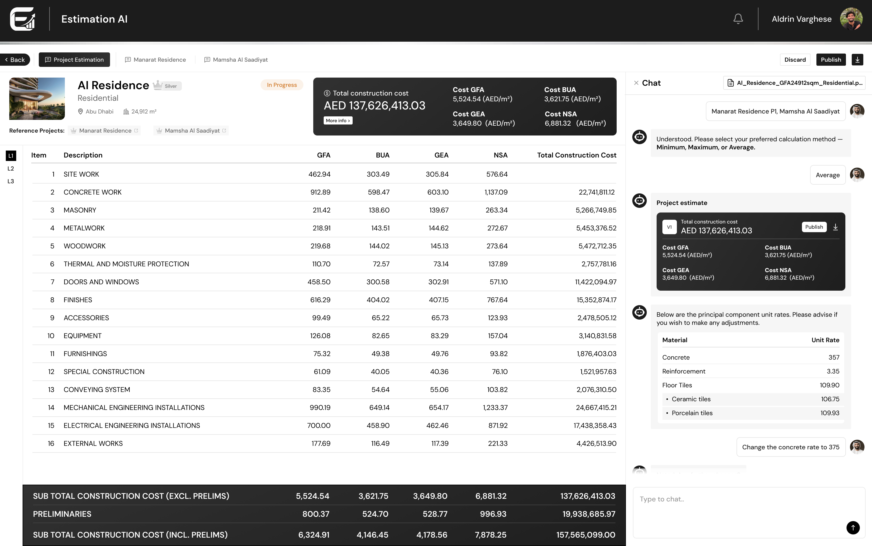
Estimation AI — L1 estimate with docked assistant
03 — navigation flow

One estimate, start to publish, in three phases.

Read it top to bottom inside each phase, left to right across them. Any step tagged with a screen jumps straight to that screen below.

Step Key moment End of flow imageHas a screen below
01 Enter
1 Sign in
SSO. Role decides who can publish.
arrow_downward
2 Estimation canvas
Zero state, then tabs: canvas · in progress · published.
arrow_downward
3 Choose a way in
Structured form for known parameters, or chat for a plain sentence.
arrow_downward
4 New estimation — chat
Seeded suggestion shows what a good first message looks like.
02 Build
5 Scope Q&A
GFA, location, category — asked one at a time.
arrow_downward
6 Comparable projects
Match scores; pick one, several, or a blend.
arrow_downward
7 Calculation method
Minimum · maximum · average.
arrow_downward
8 L1 estimate
Cost table, project facts, source document.
03 Refine & decide
9 Drill L1 → L4
Same table, four depths, one rail.
arrow_downward
10 Adjust rates → V2
Delta shown at the row that moved.
arrow_downward
11 Cost journey
Every version as a curve, with the change behind each point.
arrow_downward
12 Publish / export
PDF out; the estimate moves to Published.
u_turn_left Ways back: Discard returns to the canvas with nothing saved · Back keeps the draft under “In progress” · a published estimate reopens as the parent of a new version, so the flow loops rather than restarts.
04 — the journey, screen by screen

Nine steps, each annotated with the decision behind it.

01 · zero state
Estimation canvas, zero state one primary action
Estimation canvas with projects tabs = lifecycle cost on the cover
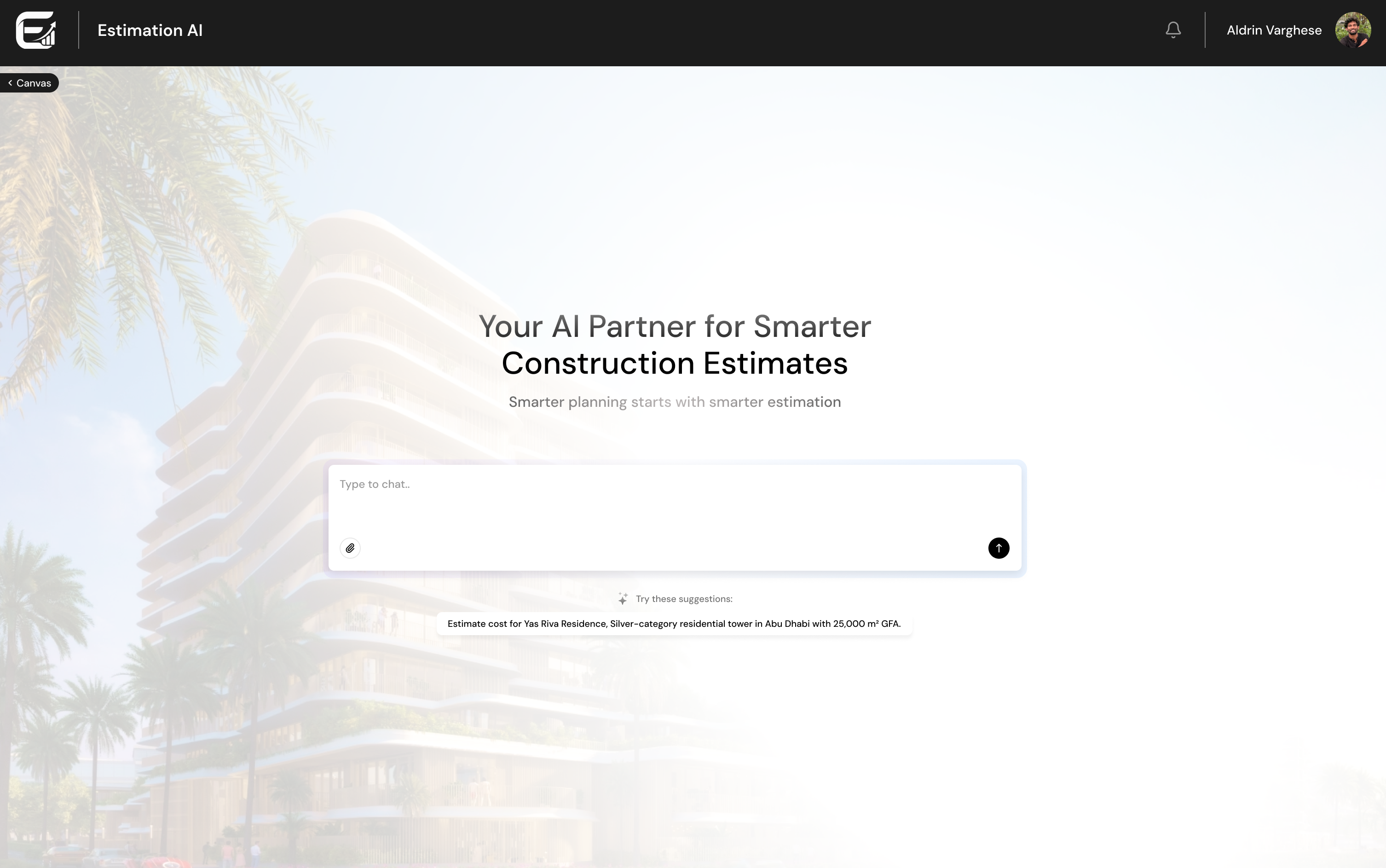
Conversational entry point seeded prompt teaches the input
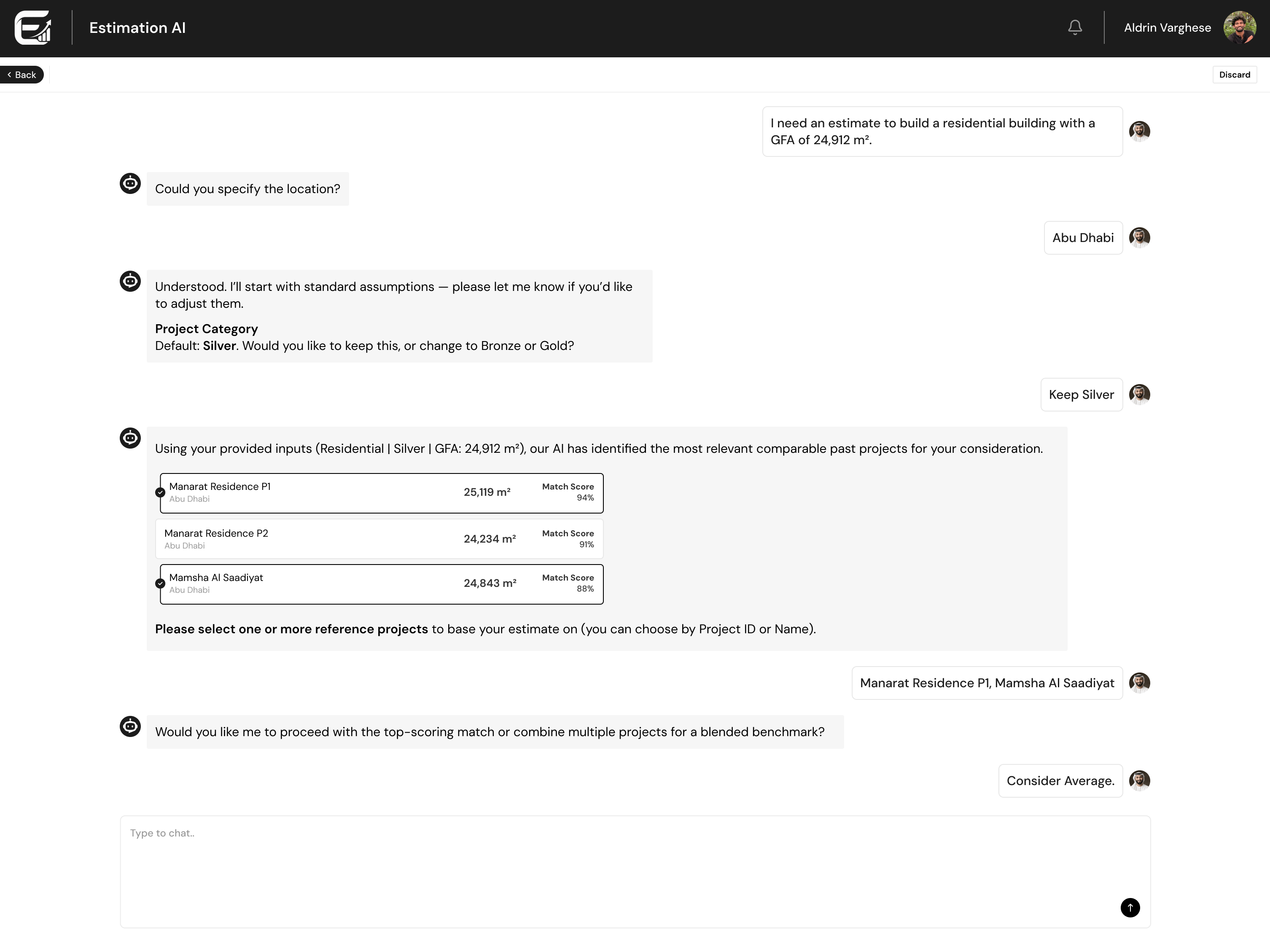
AI proposes comparable projects with match scores defaults, not interrogation match score = evidence
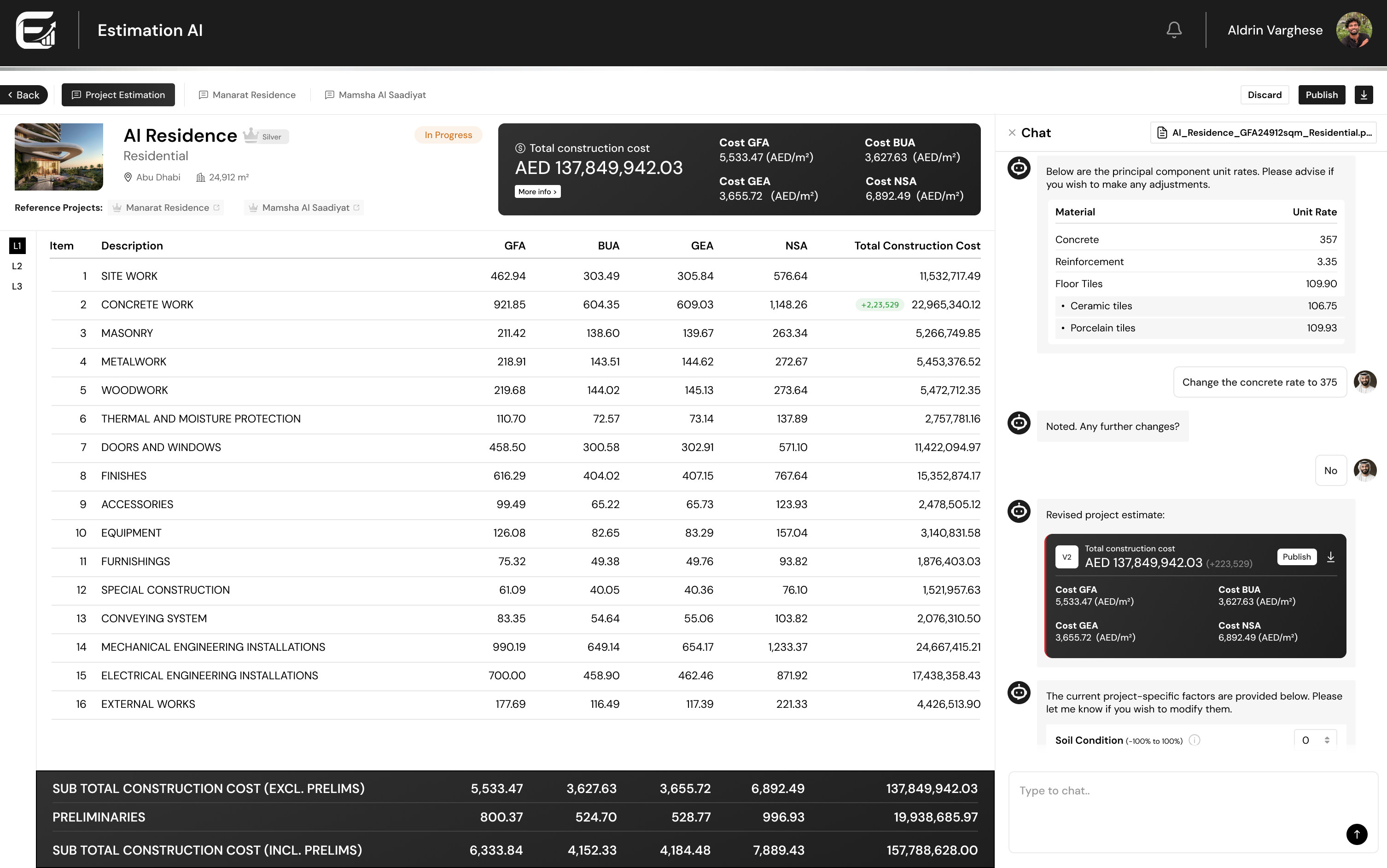
L1 estimate table with docked chat L1–L3 depth rail chat docked, never modal
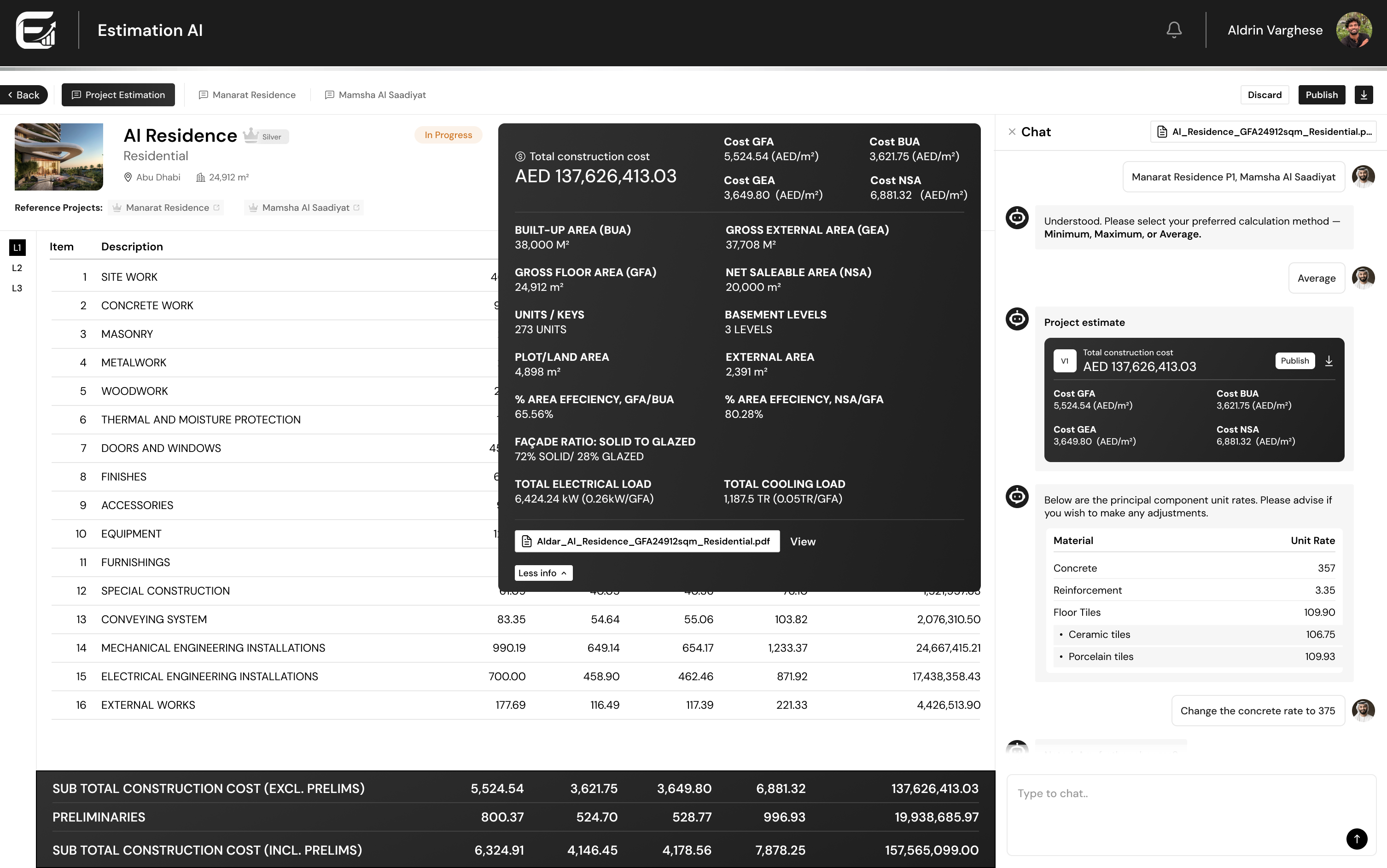
Expanded project facts panel every assumption on one sheet source document linked
Revised estimate V2 with deltas delta at the row that moved V2 is addressable
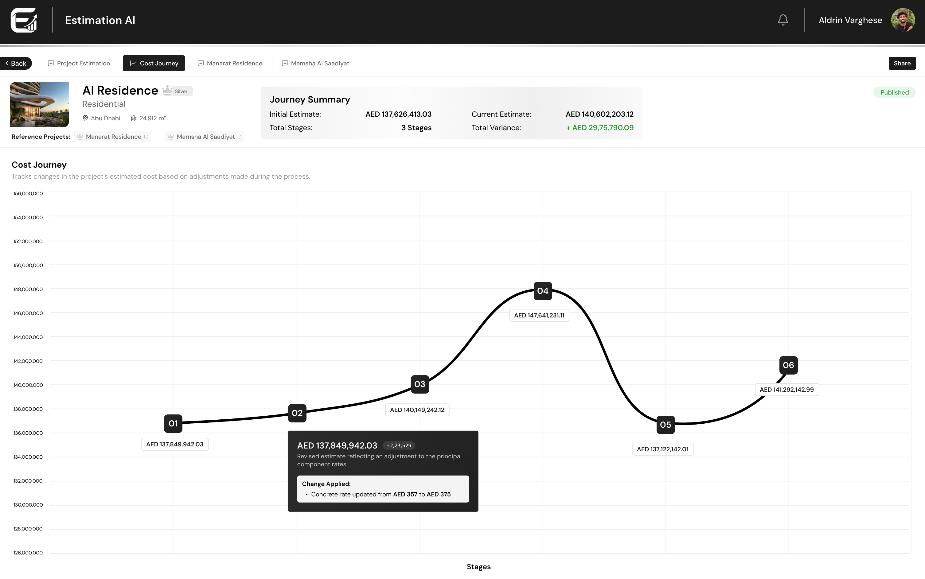
Cost journey — every version plotted over time variance stated up front each point says which change moved it
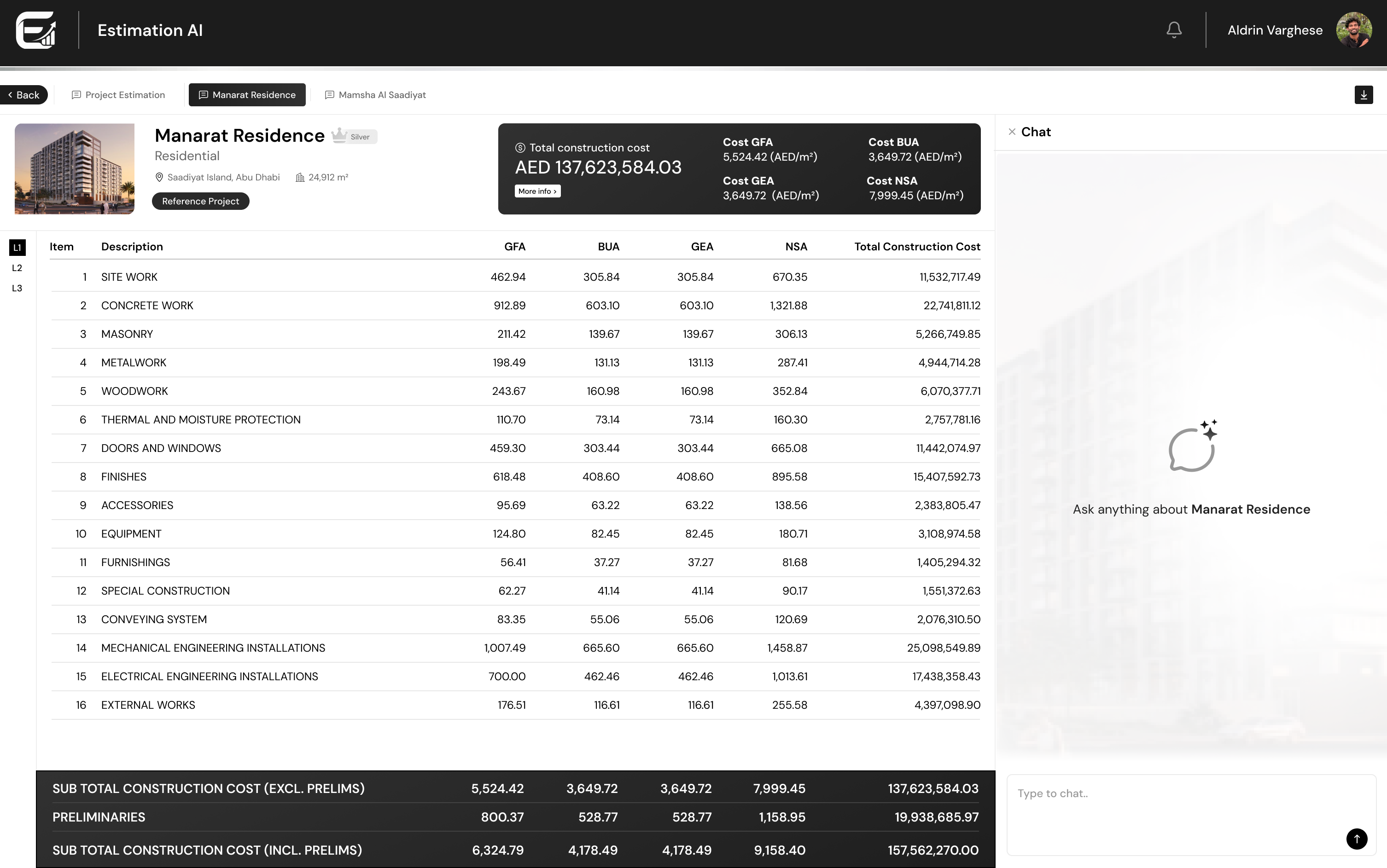
Historical reference project, L1 to L4 reference opens as its own tab chat scoped to this project
step 01entry

An empty account that still says what it is for

Most estimators met the tool for the first time here. The screen states the promise in one line and offers exactly one action, so nobody has to guess where an estimate begins.

handyman

Mine — layout, copy, CTA hierarchy, and the Angular build of the page.

psychology

Why — a zero state that shows only an empty table teaches nothing; a stated promise plus one button teaches the mental model at a glance.

report

Pain — first-run confusion in a tool replacing a spreadsheet people already trust.

step 02triage

The canvas: lifecycle as tabs, decisions on the card face

Estimation canvas, In progress and Published are the states an estimate actually moves through, so they became the navigation. Each card carries status, total cost, location, area and category — enough to triage without opening anything.

handyman

Mine — the card system, status and category chips, tab model, search scope, and the New-estimation tile that always leads the grid.

psychology

Why — cost managers scan for one project among dozens; putting the money on the cover removes an open-and-go-back loop.

check_circle

Result — one screen answers “what is running, what is done, what did it come to”.

step 03two doors

A second way in, for people who arrive with a sentence

The structured form stays for estimators who hold every parameter. Alongside it, a conversational entry with a seeded suggestion showing exactly what a good first message looks like, and an attachment control for a brief or drawing set.

handyman

Mine — the decision to keep both doors, the composer layout, and the suggestion copy.

psychology

Why — a blank chat box in an enterprise tool is a test users can fail. One realistic example sets the register — project, category, city, GFA — without a tutorial.

report

Pain — the form demanded numbers people were still negotiating at concept stage.

step 04evidence

The AI proposes, the estimator disposes

Rather than interrogating the user, the assistant states its assumptions — category defaults to Silver, say — and invites a correction. It then surfaces comparable past projects with their area and a match score, and lets the estimator pick one, several, or ask for a blended benchmark.

handyman

Mine — the conversation script, the comparable-project card, multi-select behaviour, and the min/max/average step that follows.

psychology

Why — a cost figure with no visible provenance gets rejected in review. Showing which projects it came from, and how close they are, makes the number arguable — and therefore usable.

check_circle

Result — assembling comparables, previously manual, happens inside the conversation.

step 05density

Sixteen cost heads, four area bases, one calm table

Cost per GFA, BUA, GEA and NSA against every work package, with subtotals and preliminaries pinned to the bottom so the headline never scrolls away. A depth rail moves between L1, L2 and L3 in place. The assistant stays docked, so refining a number never means leaving the estimate.

handyman

Mine — the table grid and type scale, the pinned totals bar, the depth rail, the header cost summary, and the docked-chat layout.

psychology

Why — a modal assistant forces a choice between reading and asking. Docking it keeps cause and effect on one screen.

report

Pain — the spreadsheet this replaced needed scrolling in both axes to answer one question.

step 06provenance

“More info” expands the assumptions, not another page

Areas and efficiencies, unit and key counts, basement levels, façade solid-to-glazed ratio, electrical and cooling loads — the parameters the estimate rests on, expanded in place over the table, with the source document one click away.

handyman

Mine — choosing what belongs in the sheet, its two-column reading order, and the expand-in-place interaction.

psychology

Why — the first question in every review is “what did you assume?”. Answering it without a navigation event keeps the reviewer in context.

check_circle

Result — the estimate can be defended from the screen it lives on.

step 07consequence

Change one rate, watch exactly what moved

“Change the concrete rate to 375” is a sentence, not a form. The revision returns as V2 with a delta chip on the affected row, a revised total carrying its own difference, and project factors — soil condition and the rest — offered for the next adjustment.

handyman

Mine — the versioning model, the delta chip and where it sits, the V-card in chat, and the factor controls.

psychology

Why — sensitivity analysis fails when the effect is invisible. Marking the row that changed — not just the total — turns an opaque recalculation into a reviewable edit.

check_circle

Result — versions are addressable: a reviewer can point at V2 and say why.

step 08later addition

Cost journey — version history you can read as a curve

A feature introduced after the first release: every version plotted over time, with a summary stating the initial estimate, the current one, the number of stages and the total variance. Each point on the curve opens the change that caused it — “concrete rate updated from 357 to 375”.

handyman

Mine — proposing the feature off review feedback, then designing the summary bar, the curve, the point markers and the change tooltip.

psychology

Why — teams kept asking “why is it higher than last month?”. A curve answers where it moved; the tooltip answers who moved it and how much.

check_circle

Result — the estimate carries its own audit trail into the review meeting.

step 09the corpus

Historical projects, L1 through L4

The library estimates are matched against. Each reference project opens as its own tab beside the live estimate, with the same table at L1 to L4, its own cost summary, and a chat scoped to that project alone — so comparing a benchmark never means losing the estimate you were building.

handyman

Mine — the tabbed reference model, and reusing one table system across live and historical data rather than designing a second one.

psychology

Why — a benchmark is only useful next to the thing it benchmarks. Tabs keep both in reach; a scoped assistant keeps the questions unambiguous.

check_circle

Result — one grammar learned once, used everywhere in the product.

Conversation surfacing comparable projects with match scores
Explainability, in one screen

Match score, source project and area — shown before the estimate, not after the argument.

05 — other work

One design system, a whole suite of platforms.

Screens for these sit under client confidentiality; what follows is the design problem and my contribution.

verified_user

Supplier Onboarding AI & KYS

Registration, approval and compliance governance end to end: a chatbot that collects what forms used to, multi-step verification, document management, live compliance dashboards, and Oracle Fusion ERP touchpoints.

Mine: full UX — conversational flows, multi-step form design, dashboard IA.

fact_check

AI Technical Evaluation Agent

A score nobody trusts is worthless. Multi-format document upload, automated scoring dashboards, evidence panels that answer why, and side-by-side supplier comparison for auditable procurement decisions.

Mine: explainability patterns — evidence panel, score breakdown, comparison view.

query_stats

Procurement Dashboard & Benchmark AI

Real-time intelligence over Oracle Fusion: KPI views, drill-down analytics, conversational querying, historical rate benchmarking.

Mine: KPI hierarchy, drill-down model, query-to-chart interaction.

shopping_bag

EasyBuy AI & Direct Procurement

Guided purchasing without the manual: assistants, purchase-request flows, recommendations shown with their reasoning, approval UIs with live validation.

Mine: assistant UX, guided flow, recommendation and validation states.

forum

Enterprise AI Chat Interface

For a global electronics manufacturer — a conversational workspace built for a corporate environment rather than borrowed from a consumer app: research-informed patterns, brand-aligned visual system, hi-fi prototypes for power users.

Mine: research synthesis, interaction design, visual system, prototypes.

apps

And more, on the same component library: Stakeholder AI (relationship visualisation, governance reporting) · Adhoc Payment AI · HCM Dashboard (executive workforce analytics) · POMI Governance · Contingent Worker Onboarding.

06 — how I work

No hand-off, so no design debt.

Four phases, run with the PM, the engineers and the AI/ML leads in the room — repeated until the people who live in the screen sign off.

phase 01travel_explore

Learn the domain

BOQs, ERP flows, compliance rules, how an estimator actually spends a Tuesday. Nothing goes on canvas until the vocabulary is mine.

phase 02account_tree

Map it low-fidelity

Flows, states and structure first — like the map above — so the awkward questions surface while they are still cheap to answer.

phase 03design_services

Prototype and review

Hi-fi Figma on auto-layout, components and tokens, reviewed with stakeholders, managers and the development team — repeatedly, not once.

phase 04code_blocks

Build it myself

Angular, responsive, accessible, faithful to the spec — and maintained after launch, because it is still mine.

Design & research

UX research Interaction design Design systems Figma · auto-layout, components, tokens Prototyping Data visualisation Photoshop

Build & craft

Angular TypeScript HTML5 / CSS3 Accessible production UI Git AI-assisted workflows DaVinci Resolve · GITEX, LEAP films
07 — the record

GEM Award

Gapblue Software Labs · January 2026
workspace_premium

Awarded by the VP of AI Engineering for design contributions across the client's AI programme. The citation noted that clients specifically requested these designs be replicated across their other initiatives.

ACE Award

Gapblue Software Labs · May 2024
military_tech

For the corporate website revamp — cited for passion, commitment to results, and a creative approach that lifts every project it touches.

2023 →

UI/UX Designer & Frontend Developer — Gapblue Software Labs

Sole designer across 15+ enterprise AI applications; built and maintain the unified design system and component library; executive decks; promotional films for GITEX and LEAP; led the corporate website revamp.

2019—23

B.Tech, Electronics & Communication — Christ College of Engineering

CGPA 7.54. Chief editor and designer of the department magazine, media head, IEDC and ECTA committees — where the shift into design started.

08 — contact

Happy to walk you through any of it.

Email aldrinvarghese225@gmail.com arrow_outward
Phone
+91 95672 46332
Based
Thrissur, Kerala — open to Bengaluru
Elsewhere
LinkedIn ↗
Résumé
Download PDF ↓